Sample: Cartena checkout
Reworking a marketplace’s mobile checkout so a mistake costs a shopper seconds instead of the whole order.
- Mobile checkout conversion
- +18%
- Payment-step errors
- −41%
- Median checkout time
- 1m 05s
Overview
Cartena is a fictional online marketplace where independent makers sell candles, ceramics, and textiles. Most orders start on a phone, yet mobile shoppers converted well below desktop shoppers, and the gap opened at checkout rather than at browsing or the cart.
I led design for the checkout rework: research, the new flow, updates to the component library, and the handoff, working with a PM, four engineers, and a researcher for ten weeks. I also wrote the interaction spec for the error states, which turned out to matter more than anything else we shipped.
Cartena is a made-up product, and every number, quote, screen, and video on this page is an illustrative placeholder. This sample exists to show how a full case study reads on this site.
- Discovery to launch
- 10 weeks
- PM, four engineers, researcher, designer
- 7 people
- Of orders start on a phone
- 72%
- My role
- Lead designer
The Problem
Mobile checkout converted at 38%, against 61% on desktop. Shoppers were not leaving at the payment screen itself. They left right after an error: a rejected address, a coupon that did not apply, a card field that cleared itself.
Rohit Shah
Operations manager
Ahmedabad, India
“If I have to make an account just to buy one mug, I’ll close the tab and buy it later. I usually don’t.”
- 34 years old, shops on his phone after the kids are asleep
- Buys gifts and home pieces from small sellers, one or two items at a time
- Pays by UPI or card, and abandons carts that make him retype his address
- Will not create an account for a one-off purchase
Research
Three sources, read together. Analytics showed where shoppers left. A tagged sample of 220 support tickets from the previous quarter showed what they complained about. And three rounds of moderated usability sessions on the live checkout, eight shoppers each, showed what they did and said while they did it.
Errors were the real conversion killer. 12% of payment attempts hit an error, and a third of those shoppers never returned to their cart. Most errors were recoverable in principle but not in practice: the address form cleared itself on failure, the coupon field rejected valid codes that had a trailing space, and messages appeared at the top of the page, far from the field that caused them.
A second theme was forced commitment. Shoppers who wanted one item were asked to create an account on step one, and six of the eight participants in round one said they would leave or sign up with a throwaway email.
It didn’t tell me what was wrong. It just wiped everything and made me start the address again. I wasn’t going to do that twice.
The Redesign
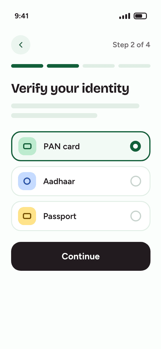
The redesign followed one principle: a mistake should cost seconds, not progress. Guest checkout became the default, with account creation offered after the order, on the confirmation page. Address entry became a single search field with a confirm step instead of six separate fields. Every error now appears inline, next to the field it belongs to, keeps what the shopper already typed, and says how to fix the problem in plain language.
The trade-off was a dependency on third-party address autocomplete, which is wrong often enough to matter. I specified a manual-entry fallback that is one tap away and never discards the autocomplete result, so the worst case is no slower than the old form. Payment methods are now ordered by how that shopper has paid before and show their logos, which cut hesitation in the last test round.

Impact
- Mobile checkout conversion, up from 38%
- 45%
- Payment attempts with an error, down from 12%
- 7.1%
- Median checkout time, down from 2m 40s
- 1m 05s
- Guest buyers who created an account afterward
- 22%
Six weeks after launch, the gap between mobile and desktop conversion had narrowed from 23 points to 16, and 22% of guest buyers created an account on the confirmation page, which gave the growth team a retention channel nobody had to be forced into.
What I would do differently: instrument the error states from day one. We only learned how often shoppers used the manual-address fallback after launch (about one attempt in five), and knowing that earlier would have changed how much polish it got in design.