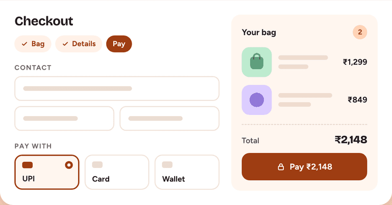
Sample: Fintrack onboarding
Rebuilding a money app’s first five minutes around what people came to do, so more of them reach their first budget.
- Onboarding completion
- +34%
- Time to first budget
- −68%
- Week-1 return rate
- +24%
Overview
Fintrack is a fictional personal-finance app that helps salaried professionals see where their money actually goes. It connects to bank accounts, sorts transactions into categories, and nudges people toward a monthly budget. The product worked once people were inside. Getting them inside was the problem.
I was the lead product designer on a six-person squad (a PM, three engineers, a researcher, and me) for eight weeks. I owned the research synthesis, the new onboarding flow, the interaction and visual design, three rounds of prototype testing, and the handoff to engineering.
Fintrack is a made-up product, and every number, quote, screen, and video on this page is an illustrative placeholder. This sample exists to show how a full case study reads on this site.
- Discovery to handoff
- 8 weeks
- PM, three engineers, researcher, designer
- 6 people
- Platforms
- iOS + Android
- My role
- Lead designer
The Problem
Only 41% of new users finished onboarding, and the steepest cliff was step four, where Fintrack asked for bank access: 38% of the people who reached it quit the app and did not come back that week.
Neha Kulkarni
Product analyst
Pune, India
“I don’t mind sharing my accounts. I just want to see what I’m getting before I do.”
- 28 years old, salaried, saving for a home down payment
- Tracks spending in a notes app and a spreadsheet she rarely opens
- Wary of apps that ask for bank access before showing any value
- Opens apps in short bursts: the commute, lunch, late evening
Research
I started with what the data could already tell us. A funnel review of the previous 90 days showed where people left, and replays of 40 abandoned sessions showed what they were doing just before they did. Then I ran twelve 30-minute interviews: six people who had finished onboarding and six who had quit.
Affinity-mapping the 140 notes from those sessions gave four themes, and one of them reframed the project. People were not afraid of Fintrack. They were afraid of the order of things. Every one of the six who quit said some version of “it wanted my bank login before it showed me anything.”
Two supporting findings shaped the solution. People arrived with one question in mind (“why am I broke by the 20th?”), but the old flow opened with a twelve-category picker that answered a question nobody had asked. And three permission prompts (notifications, contacts, camera) fired in the first minute, before the app had earned any of them.
It wanted my bank login before it showed me anything. That’s like a stranger asking for my house keys so they can give me a quote.
The Redesign
Three decisions carried the redesign. Goal first: one question (“What do you want Fintrack to help with?”) replaces the twelve-category picker, and the answer chooses the example dashboard people see next. Preview before permission: bank linking now follows a populated sample dashboard, so people see what they are about to unlock. Earn each prompt: notifications are requested after the first budget exists, in context, with one sentence on what they will get.
The trade-off was real. Moving bank linking later meant the first dashboard ran on sample data, and the team worried it would feel fake. We labeled it plainly as an example and added a manual path: add one transaction by hand and get a real budget in under two minutes, with no permissions at all. The flow went from nine screens to four.
Impact
- Completed onboarding, up from 41%
- 55%
- Median time to first budget, down from 6m 40s
- 2m 10s
- Left at bank linking, down from 38%
- 17%
- Support tickets about linking a bank
- −44%
Four weeks after launch, the share of new users who came back within a week had risen from 29% to 36%, and the squad reused the sample-dashboard pattern in the budgeting flow that followed.
What I would do differently: test the manual-entry path earlier. It performed better than anyone expected, and it only entered the design in the second test round. The lesson I keep from this project is to design the order of the asks as carefully as the screens themselves.